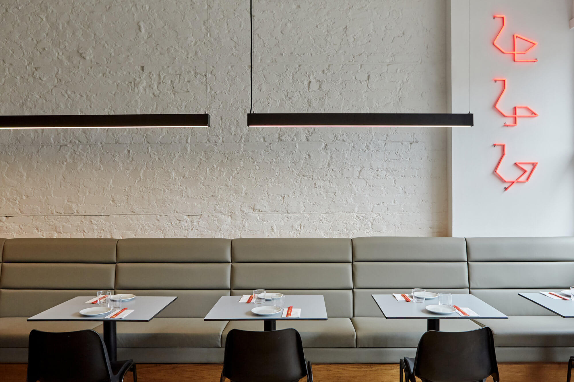
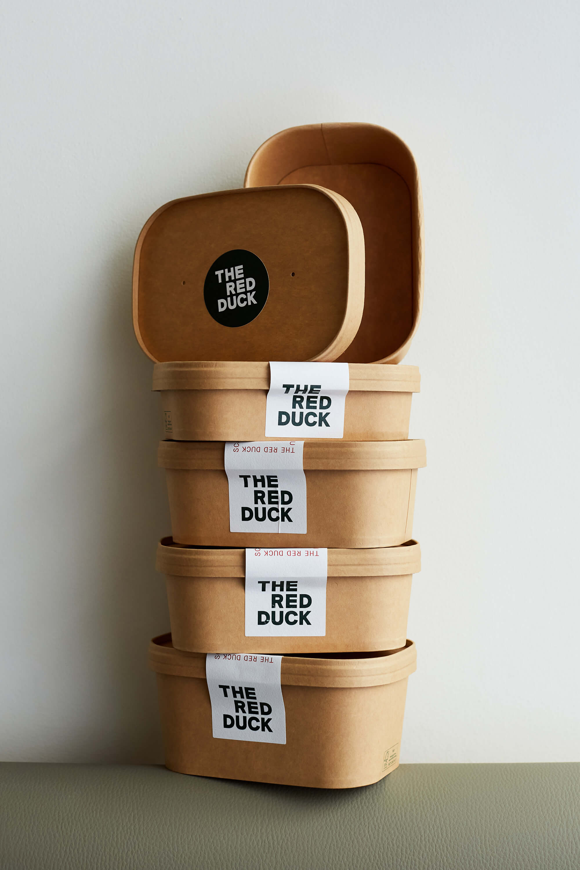
A clean and visually reductive identity for a new contemporary Chinese Restaurant in Balham. Taking reference from the restaurant name to create a playful and flexible graphic system that underpins the identity.
- Visual Identity
- Signage & Wayfinding
- Social
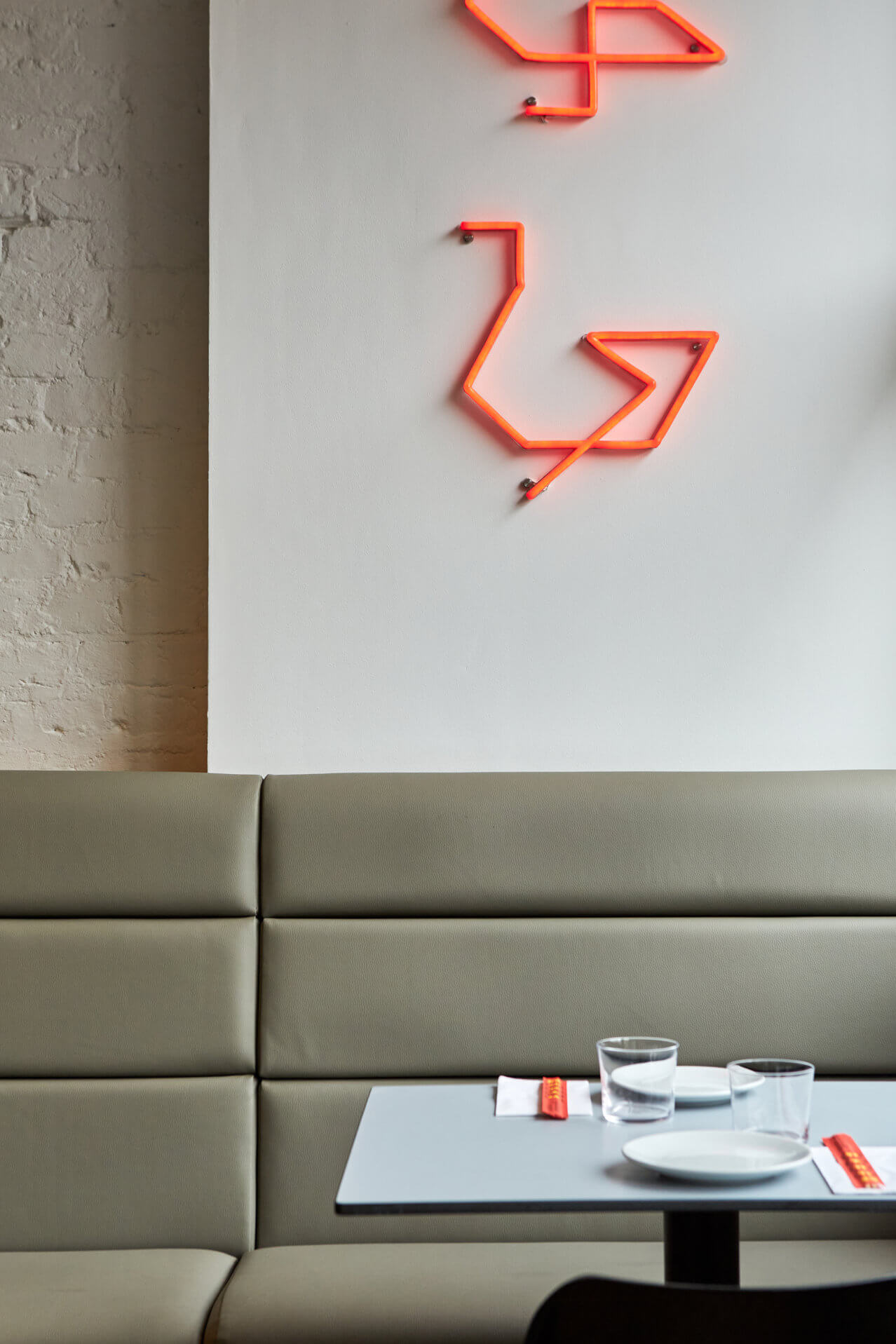
Dynamic Ducks
To sit alongside the bold, structural logotype we wanted to explore a flexible, dynamic element to the identity. We developed a graphic system that allowed the creation of abstract ducks, iconography, letterforms and decorative styling.

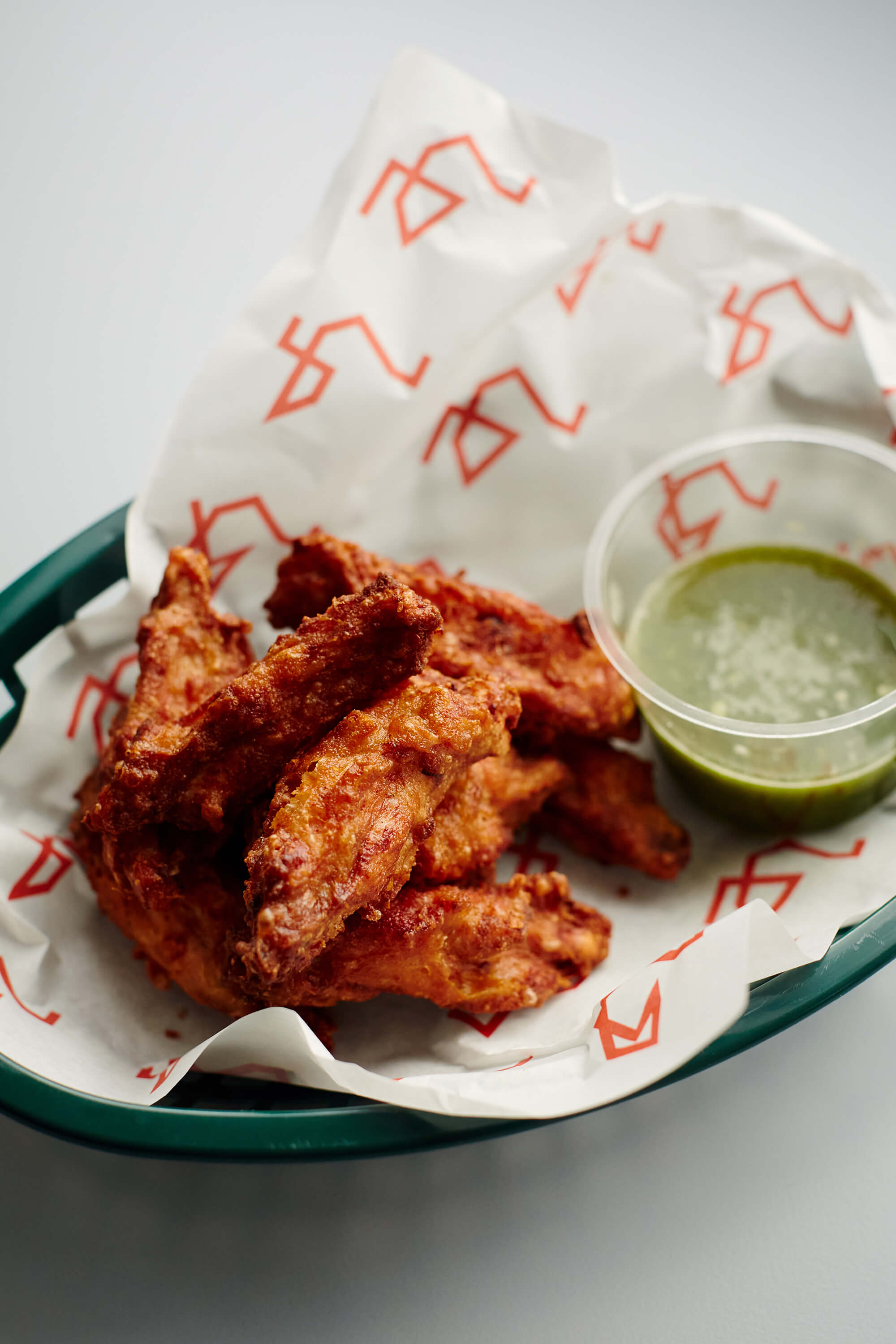


After launch we worked with The Red Duck to continue the red thread of the brand throughout the space. Creating detailed executions of the visual identity using both printed material and painted signage.
- Sign painting by Simon Memel.